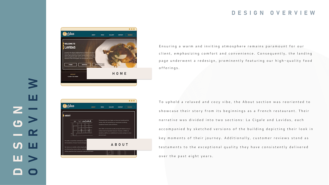
SUMMARY
Lavidas is a restaurant located in the city of Vancouver. Recently, they underwent a complete rebranding, transitioning from a French cuisine bistro (La Cigale) to a Canadian-contemporary restaurant.
Although the website was updated after their reopening, the client is had received feedback about the overall appearance and functionality of their website. Therefore, they are requesting UX Research to evaluate the current state of their website, its effectiveness, and determine how to elevate it to meet their standards as well as those of their customers.
— PROJECT NAME
Lavidas
— ROLE
Art Direction
Graphic Design
Branding
— DATE
Feb-Mar, 2024
To assess the current state of the client’s website, a group of four (4) users was recruited to conduct a usability test, evaluating their experience in navigating the website.
None of the users reported having any prior knowledge of the restaurant.
The test began when the users initiated a Google search for the restaurant and followed the user flow as if they were potential new clients deciding whether to make a reservation.
Google Search ⭢ Explore Site (learn about the place) ⭢ Explore Menus (learn about the different menus and specials) ⭢ Make a Reservation
After the first design iteration, a second usability testing was conducted, this time with five (5) users who using the same approach that the first test, explored the prototype of the design proposal.
Some of the users had prior knowledge about the restaurant.
DISCOVERIES
— Accessibility and parking information were not clearly provided.
— Imagery on the website hindered readability.
— The gallery was not achieving the desired impact, and the large number of photos made scrolling tedious.
— The menus were somewhat hard to read and some information was missing.
— The overall appearance gave the impression of a low-quality restaurant.

OPPORTUNITIES
— Optimize the imagery to improve legibility and overall website presentation.
— Enhance menu display for clearer content delivery.
— Include accessibility information on the main website.
— Improve the current Gallery to ensure consistency, relevance, and appeal to the users.


DISCOVERIES
— Users wanted to be able to interact with the Gallery.
— Users appreciated the illustrations and consistency in graphics.
— The menu lacks clarity regarding options for alternative diets.
— Overall, users welcomed the appearance, particularly those familiar with the restaurant.
— Some users found it challenging to spot Special Events, such as Wednesday Wine.
— The overall user experience improved significantly and consistently across all touch points.

OPPORTUNITIES
— Make the Gallery interactive to allow users to appreciate images more closely.
— Ensure alternative options are displayed clearly, if available.
— Enhance visibility of Special Events.
IMPACT
The goal of this design was to improve user-restaurant communication, elevate website browsing experience, and provide all essential information for a seamless user experience.
Additionally, the design proposal aimed to enhance the website's appearance and imagery to align with the quality of their products.
According to the results obtained from the second test run, both goals have been accomplished successfully.
Main Impact:
— The hero section now showcases the client's product, shifting the focus to menu exploration.
— The photos in the Gallery were curated and tailored to better entice the user. Additionally, the page is now easier to navigate, as the reduced number of images no longer requires endless scrolling to review them, allowing users to focus on a smaller but more effective Gallery.
— Throughout the test run, users consistently reported a significant improvement in ease of use and appearance.
NEXT STEPS
— Conduct a User Testing of the design proposal to ensure all pain points have been addressed successfully and gather feedback and insights on its effectiveness.
— Enhance online presence by improving their social media: update information on platforms updated, maintain a consistent post format, and clarify the role of each of platform in their online presence.
— Optimize the new design for other devices based on UX feedback and design proposal; to make sure users can visualize the website correctly and with ease.